Call Panel UX/UI Revamp
Beta release · Internal · v1.3.59
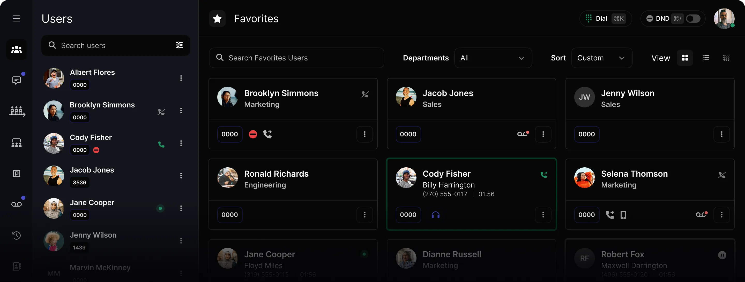
General layout
Consistency,
reduced cognitive load
By mirroring the natural left-to-right reading pattern, the interface now offers a more intuitive user experience.
- 1
Main Navigation
Apps and top-level destinations on the far left.
- 2
Sidebar
Section-level content and filters, in context.
- 3
Main Content
The workspace — clean, focused, always primary.
- ↑
Header
High-level context: titles, status, user settings.
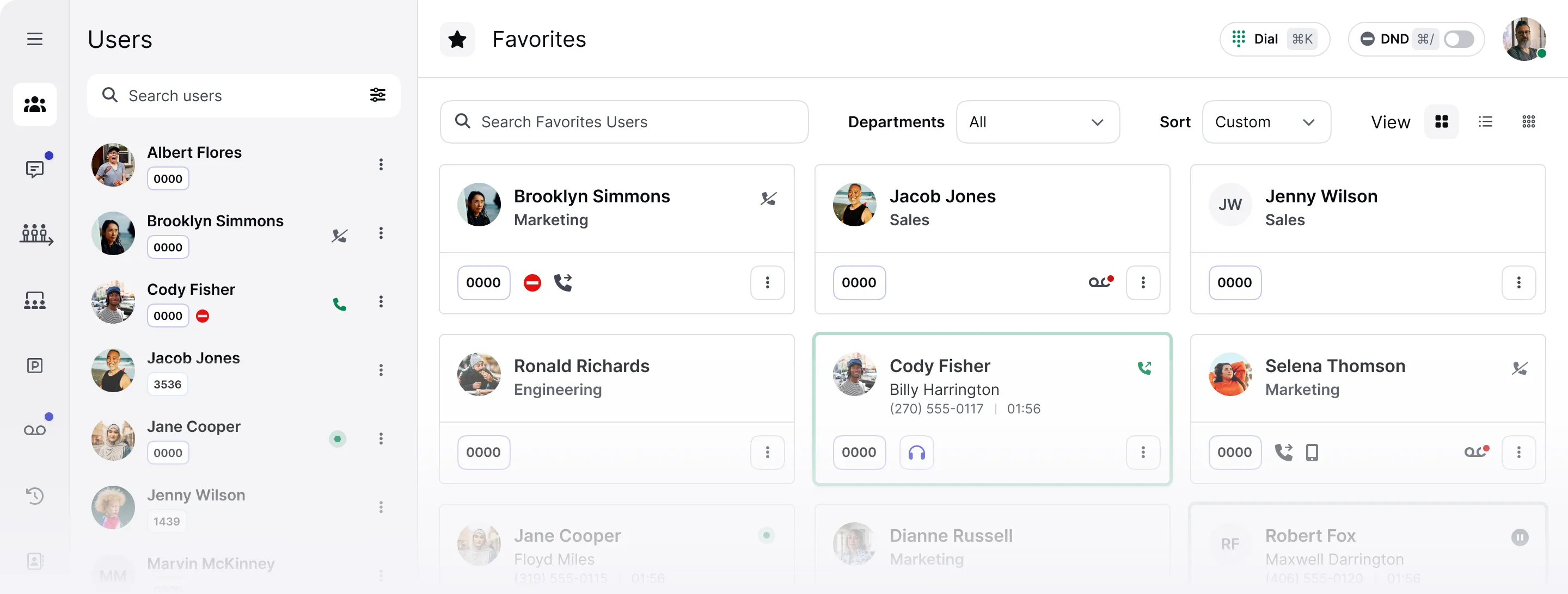
Header
Streamlined for quick access
The two most-reached-for controls — each with its own keyboard shortcut to improve efficiency.
Open the dialer instantly from anywhere in the panel. Dial a number, search contacts, or browse history.
Silence incoming calls without leaving the panel. Flip the toggle or use the shortcut.
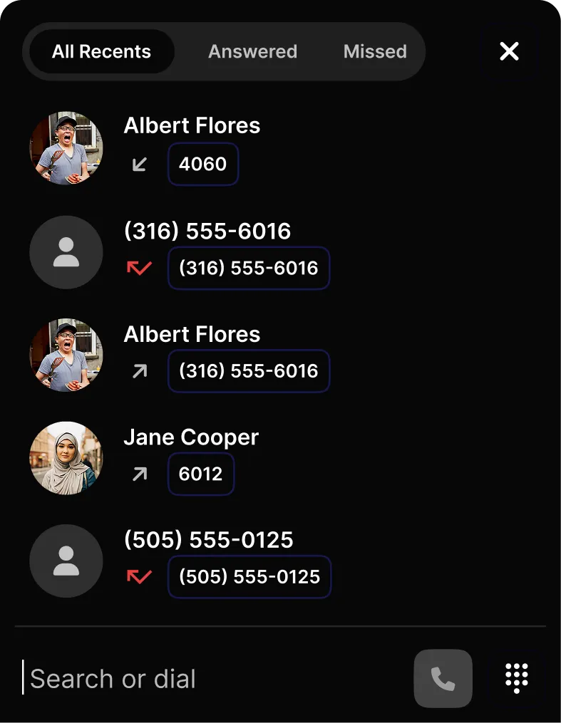
New dialer experience
Calls at the bottom.
Workspace clear.
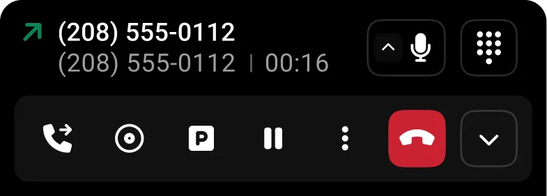
Bottom docking
Active calls live at the bottom — workspace stays clutter-free.
Right-to-left order
Calls arranged right to left in the order they are received.
Collapsed cards
Cards collapse to maximize screen real estate during active calls.
Smart placeholder
Dial opens a placeholder that transforms into the outgoing call card.
More updates
Sections, User Menu & Themes

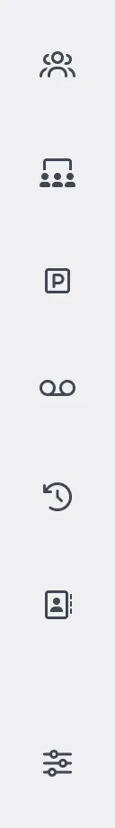
Sections
- Users
- Conferences
Audio + video, pin favorites
- Parking
- Voicemail
- Call History
New filters
- Contacts
- Settings
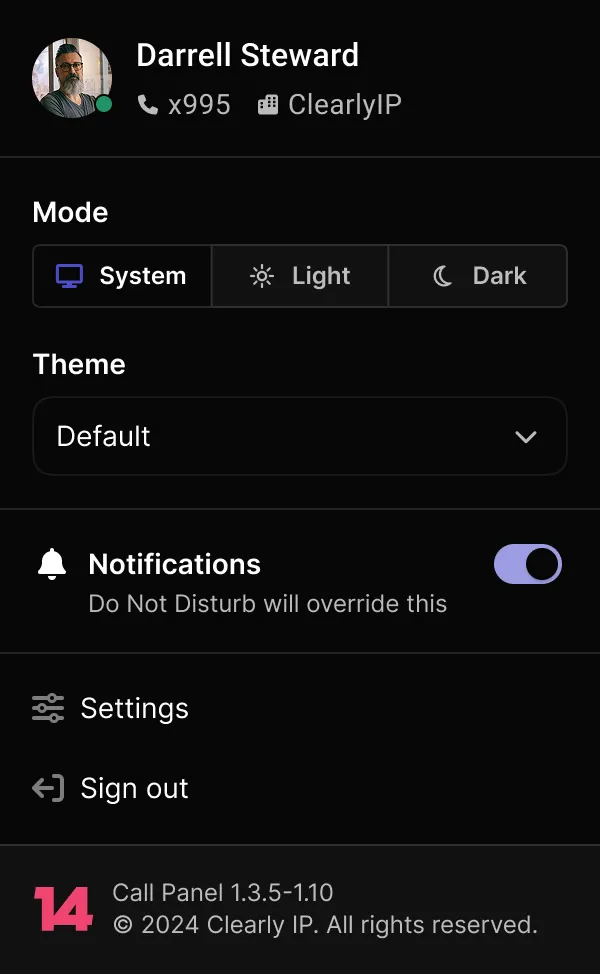
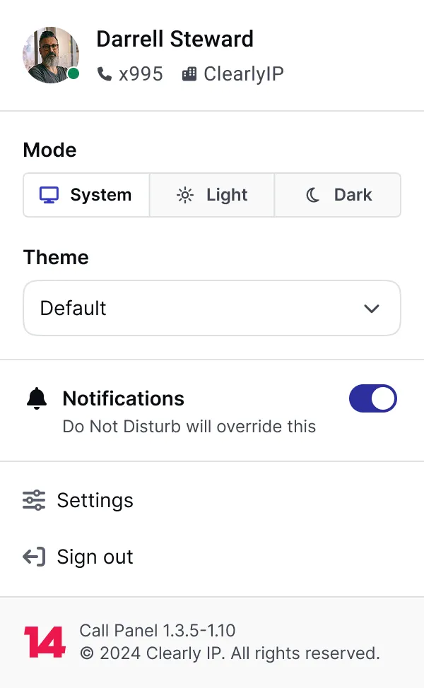
Redesigned layout
Improved accessibility and visual hierarchy for account management.
Custom theming
Beyond Light and Dark — custom themes as a proof of concept.
Coming soon: Chats, SMS & Queues
See it live
The new Call Panel is live on staging. Explore the layout, test the shortcuts, and share your feedback.